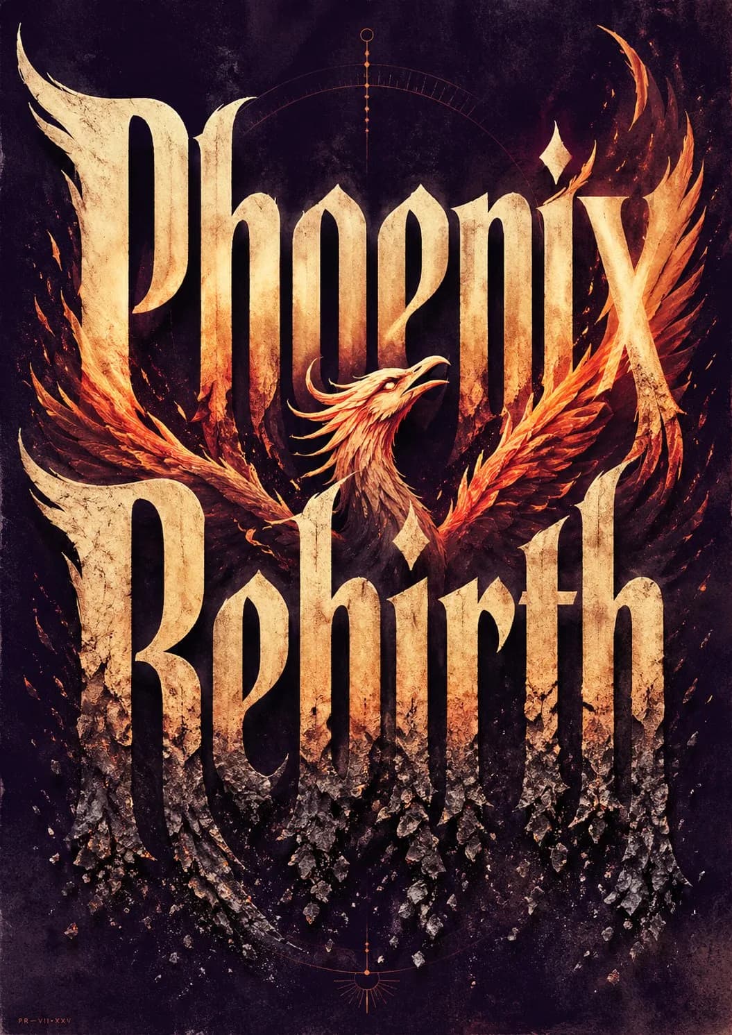
Conceptual Typography Poster Design AI photo style example on PhotoReady
PhotoReady | photoready.kaamkardo.com
Custom Creator Style

Conceptual Typography Poster Design

Created by
@gpt-image-2-library
Prompt source:@doteyviaawesome-gpt-image-2

Rights holder? Request removal via our contact page.

#Posters & Typography#Poster#Realistic#Brand#Tech#Commerce#Social
Freeper generation
Secure transactions and inputs
Outputs completed in under 15 seconds
Powered by Photo Ready Engine
Use this prompt in

Every click copies the prompt. ChatGPT and Grok open with it already typed; the rest need one paste.

Prompt Template
Free Access
Create ONE finished premium conceptual typography poster for the exact title: “[INPUT_TEXT]” Single poster only. No moodboard, grid, presentation board, mockup, captions, prompt text, process sheet, or sample labels. The title “[INPUT_TEXT]” must be the dominant visual structure of the poster: huge, readable, powerful, and spelled exactly. Do not translate, shorten, replace, or misspell it. Do not add other large readable text. Optional micro catalog text is allowed only if it stays subtle and secondary. Silently interpret the title’s meaning, mood, cultural aura, symbolic associations, psychological tension, and visual rhythm. Turn that interpretation into one strong visual metaphor. Typography is the hero. Design custom-looking letterforms whose weight, width, contrast, spacing, rhythm, distortion, negative space, edge quality, and ink texture express the temperament of the title. The type should feel intentionally designed, not like a default font. If “[INPUT_TEXT]” refers to a widely known person, make a large editorial portrait or full / half-body figure a major visual presence, occupying roughly 40–70% of the composition. The figure should feel recognizable through aura, posture, styling, era, expression, lighting, and symbolic atmosphere, but should not copy a specific existing photograph, official poster, campaign image, logo, slogan, or copyrighted composition. The portrait must interact with the typography: overlapping the letters, emerging from them, being framed by them, casting shadows on them, breaking through them, or being partially hidden behind them. For all other titles, use a human figure, landscape, object, or atmospheric setting only when it strengthens the meaning. It must interact with the typography and deepen the concept, not decorate it. Use a rich but restrained 4–6 color system matched to the theme: dominant background color, primary typography color, figure / landscape tone, emotional accent color, muted support color, and subtle paper / ink texture tone. Avoid flat black-white-red defaults unless conceptually necessary. Composition style: high-end editorial poster, museum-quality graphic design, dramatic scale, strong hierarchy, few elements, intelligent whitespace, bold flat color areas, sharp cropping, silkscreen / lithograph / risograph grain, paper fibers, subtle ink imperfections, refined visual tension. The final image should feel like a complete visual sentence: the title, the figure or setting, the color, and the typography explain each other. Avoid generic word art, glossy 3D lettering, random icons, stock-photo realism, cluttered collage, excessive grunge, tourist clichés, official logos, copied slogans, copied campaign aesthetics, unrelated text, and misspelled typography. ----- INPUT_TEXT: Phoenix Rebirth

Prompt explanation

The prompt anchors the model around posters & typography, then narrows the output with outfit, background, lighting, pose, expression, and camera instructions. The most important variables to preserve are face identity, realistic skin texture, clear eyes, natural proportions, and the professional portrait lens with realistic depth of field look.

Editable variables

OutfitBackgroundLightingPoseExpressionCamera

Expected output

A realistic posters & typography image with soft, realistic portrait lighting, a simple background that keeps attention on the face, a confident, approachable expression, and clear facial identity.

Common mistakes

  • Using a blurry or heavily cropped source photo.
  • Mixing formal and casual style instructions in the same prompt.
  • Adding too many props or background details.

Tips

  • Keep the clean, polished clothing that matches the intended use direction consistent with the final use case.
  • Preserve the soft, realistic portrait lighting and professional portrait lens with realistic depth of field terms when editing.
  • Use one clear face reference for the most reliable identity match.

Visual evidence for this style

Generated example for Conceptual Typography Poster Design

Generated example

Create a striking typography poster featuring the title '[INPUT_TEXT]' as the focal point, blending visual metaphor with custom letterforms and rich colors.

Background detail for Conceptual Typography Poster Design

Background detail

a simple background that keeps attention on the face

LinkedIn preview crop for Conceptual Typography Poster Design

LinkedIn preview crop

a natural pose with clear face visibility with a confident, approachable expression.

About this style

Conceptual Typography Poster Design is a posters & typography style built for posters & typography images, profile photos, and creator visuals. It combines clean, polished clothing that matches the intended use, a simple background that keeps attention on the face, soft, realistic portrait lighting, a natural pose with clear face visibility, and a confident, approachable expression so the generated image feels intentional rather than random. The goal is not only to copy a prompt, but to understand the visual system behind the output.

This style is especially useful for professionals because it keeps the result focused on credibility, facial clarity, and repeatable framing. The professional portrait lens with realistic depth of field direction helps the image look closer to a real portrait session, while the background and lighting choices reduce distractions that can weaken a profile photo, resume image, creator bio, or portfolio thumbnail.

For best results, start with a sharp source image where the face is unobstructed and the head is not heavily cropped. Keep the outfit and background aligned with the final use case: more formal for LinkedIn, resumes, company pages, and founder bios; softer and more expressive for creator profiles, social media, and personal branding.

Structured style metadata

Category
Posters & Typography
Use case
posters & typography images, profile photos, and creator visuals

Best use cases for Conceptual Typography Poster Design

Create a striking typography poster featuring the title '[INPUT_TEXT]' as the focal point, blending visual metaphor with custom letterforms and rich colors.

Who should use it

This style fits professionals who need a polished image for posters & typography images, profile photos, and creator visuals. It is useful when the photo needs to look credible, current, and easy to reuse across professional profiles.

Why this works

The combination of soft, realistic portrait lighting, a simple background that keeps attention on the face, and a confident, approachable expression makes the final image readable at small profile-photo sizes while still feeling realistic at full size.

Outfit guide

Use clean, polished clothing that matches the intended use. Avoid clothing that fights the style direction, especially busy patterns, oversized logos, or colors that clash with the background.

Background guide

The best background is a simple background that keeps attention on the face. It should support the subject without making the final image look staged, crowded, or overly decorative.

Camera and expression guide

Keep professional portrait lens with realistic depth of field, a natural pose with clear face visibility, and a confident, approachable expression. These details help the output read like a real portrait rather than a generic AI image.

Common questions about the Conceptual Typography Poster Design style

Is the Conceptual Typography Poster Design style free?

Yes. You can copy this style prompt directly from this page and use it in your own image tool.

What source photo works best with this style?

Use a clear portrait with good lighting, an unobstructed face, and minimal blur for the most realistic result.

Can I adapt the prompt?

Yes. Keep the core camera, lighting, and mood terms, then swap details such as outfit, background, or occasion. For this style the terms worth preserving are professional portrait lens with realistic depth of field and soft, realistic portrait lighting.

Which professions suit the Conceptual Typography Poster Design style?

It works best for professionals, and can be adapted for adjacent roles by changing outfit, background, and expression details.

What should I avoid?

Avoid low-resolution uploads, covered faces, extreme filters, crowded backgrounds, and instructions that conflict with the style metadata.

Can this style be used for a LinkedIn profile photo?

Yes, especially when the outfit, background, expression, and crop match the professional audience you want to reach. LinkedIn crops profile photos to a circle, so keep the face centred.

Related guides

More styles like this
Photo Ready Logo
Photo Ready